Hello, I'm Jessica Branks

A UI/UX designer with a passion for creating thoughtful, user-centric experiences.

"As a self-taught UI/UX designer I am fascinated with the intersection of design and technology and always seeking to grow and learn something new."

Learn More About Me

UI/UX DESIGN

TeamFlow

Web Application

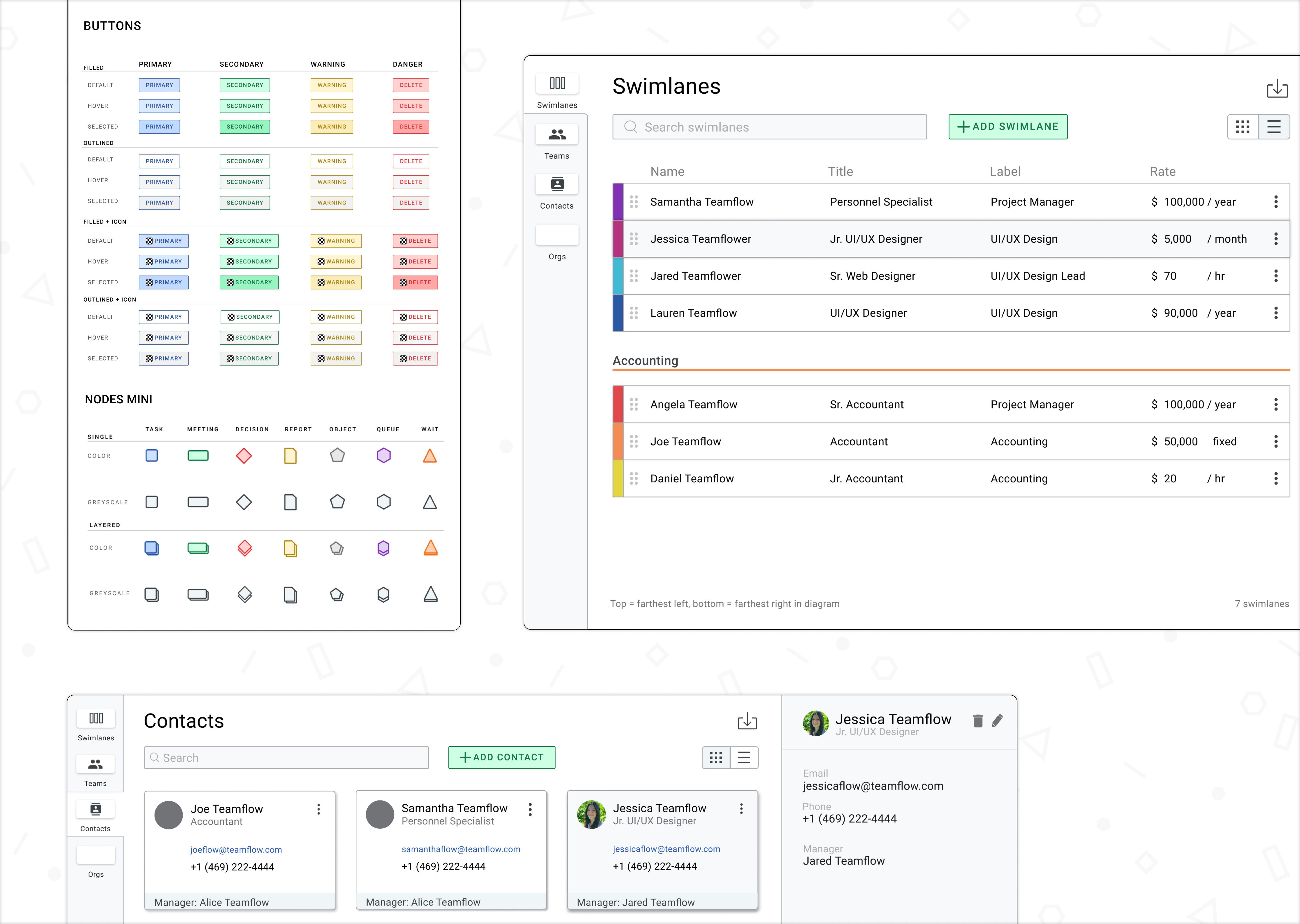
overview of project deliverables in a collage of 3 images showcasing button states and node styles, a swimlanes page, and contact page
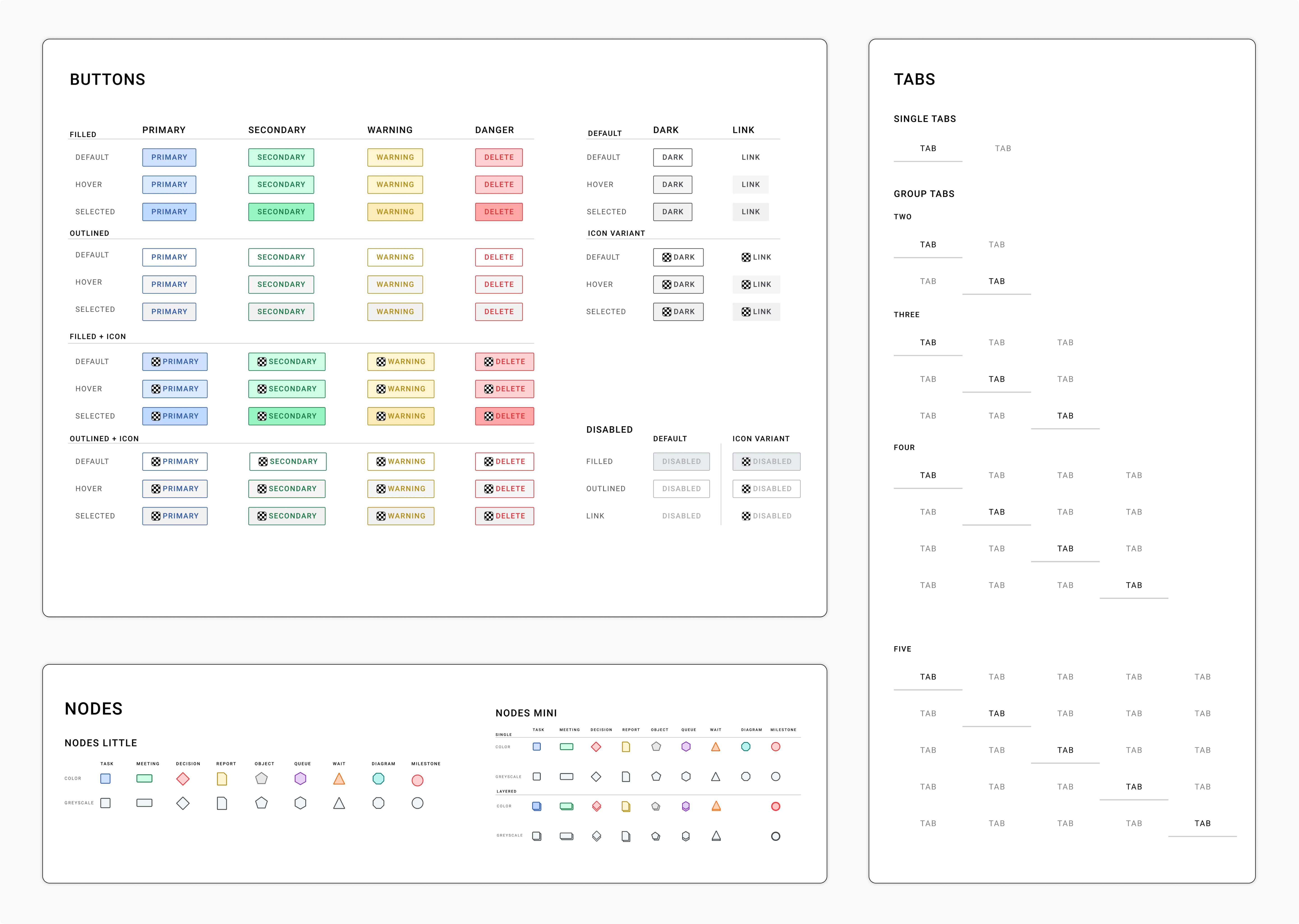
showcase of mutliple design system components including button states and variables, tabs, and nodes

About the project

TeamFlow is a web application designed to provide organizations an efficient way to build clear and consistent process flow diagrams. I was tasked with helping update the company's design systems library and build prototypes for the web application in Figma.

Design Systems Library

I had the opportunity to collaborate with a senior UX designer at TeamFlow to update their design systems library. We discussed the different button states and variants that needed to be updated, and I helped implement those changes and built new button components.

I also worked on streamlining the button components with existing styles in the library and created a naming system for the variants in Figma that would help speed up prototyping moving forward.
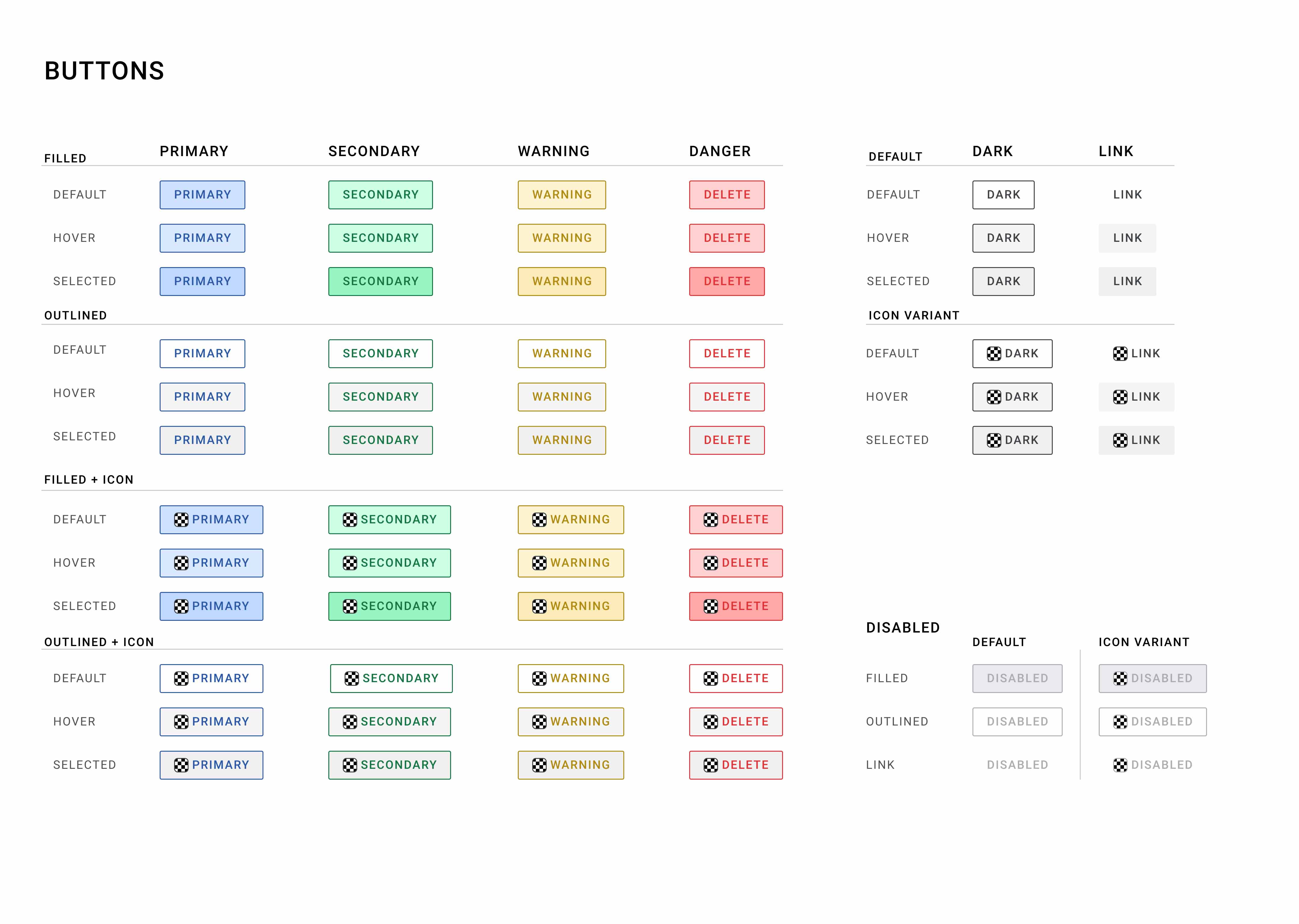
focusing in on primary, secondary, default, and icon variants of button components and all of their states
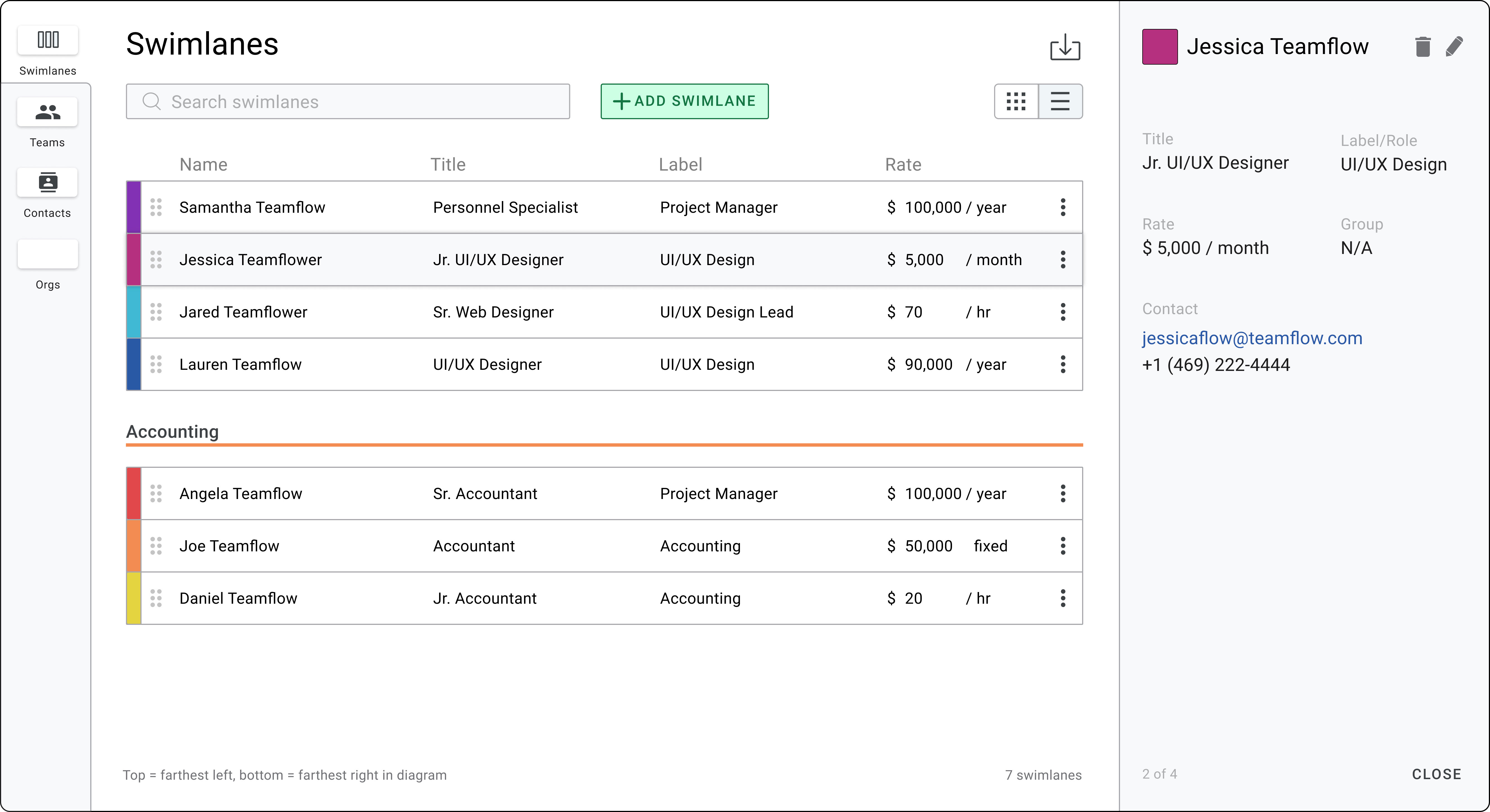
modal on the swimlane tab selected in a left-hand menu, in the center it displays swimlanes with the ability to search add and organize swimlanes, and a panel on the right-hand side to display detailed information of the selected swimlane.

Modal Prototypes

The swimlane modal needed to be reworked to accommodate more informational details that would be useful for the user to add as well as a more efficient way for the user to organize, edit, and add swimlanes to their project. We also wanted to include the contact and team features to this modal for easier access because their information can be linked to the swimlanes.

Overall, we needed to update the modal to create a more streamlined and efficient way for users to view and edit this information.
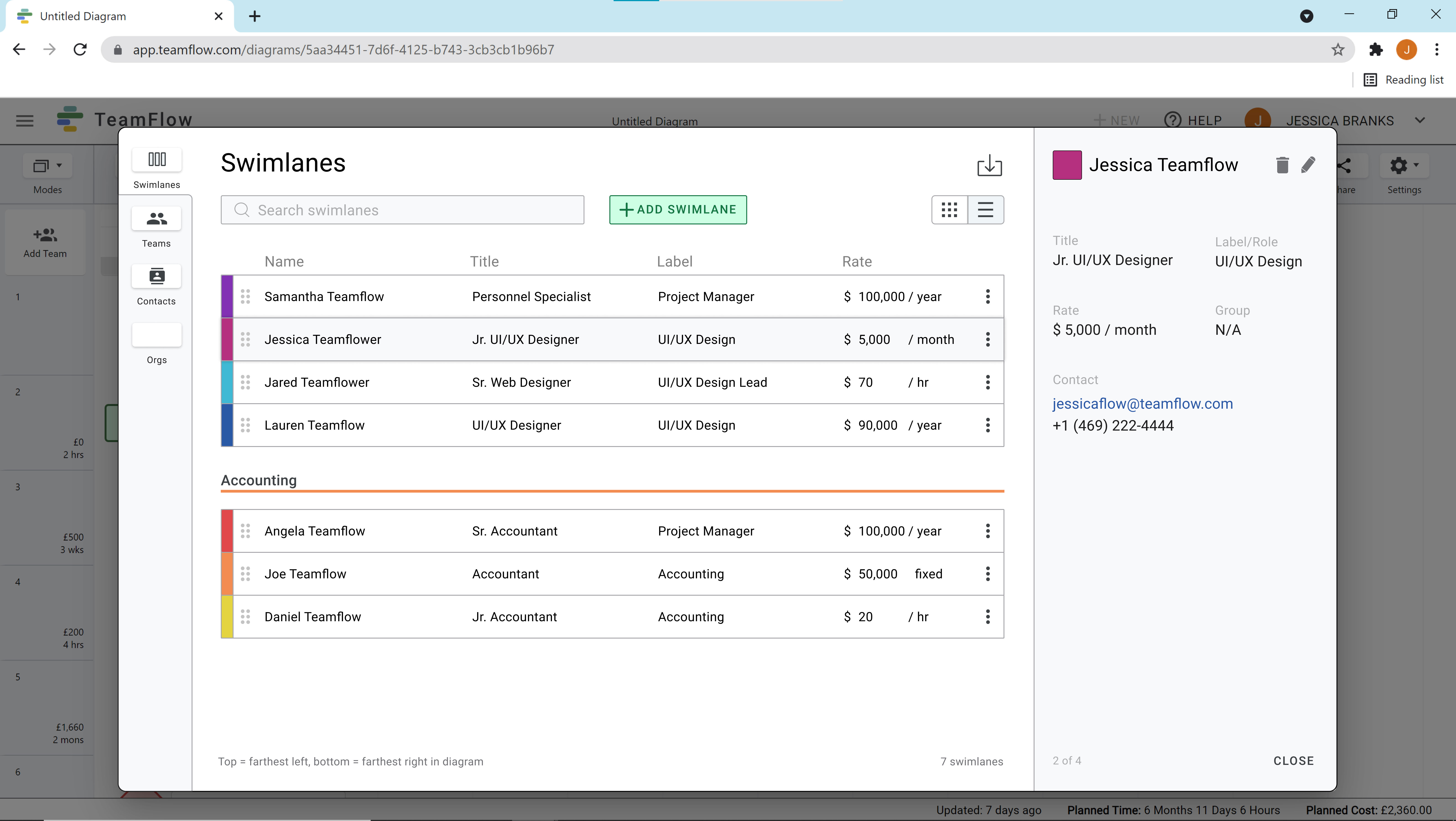
list view version of the same swimlane tab in the modal
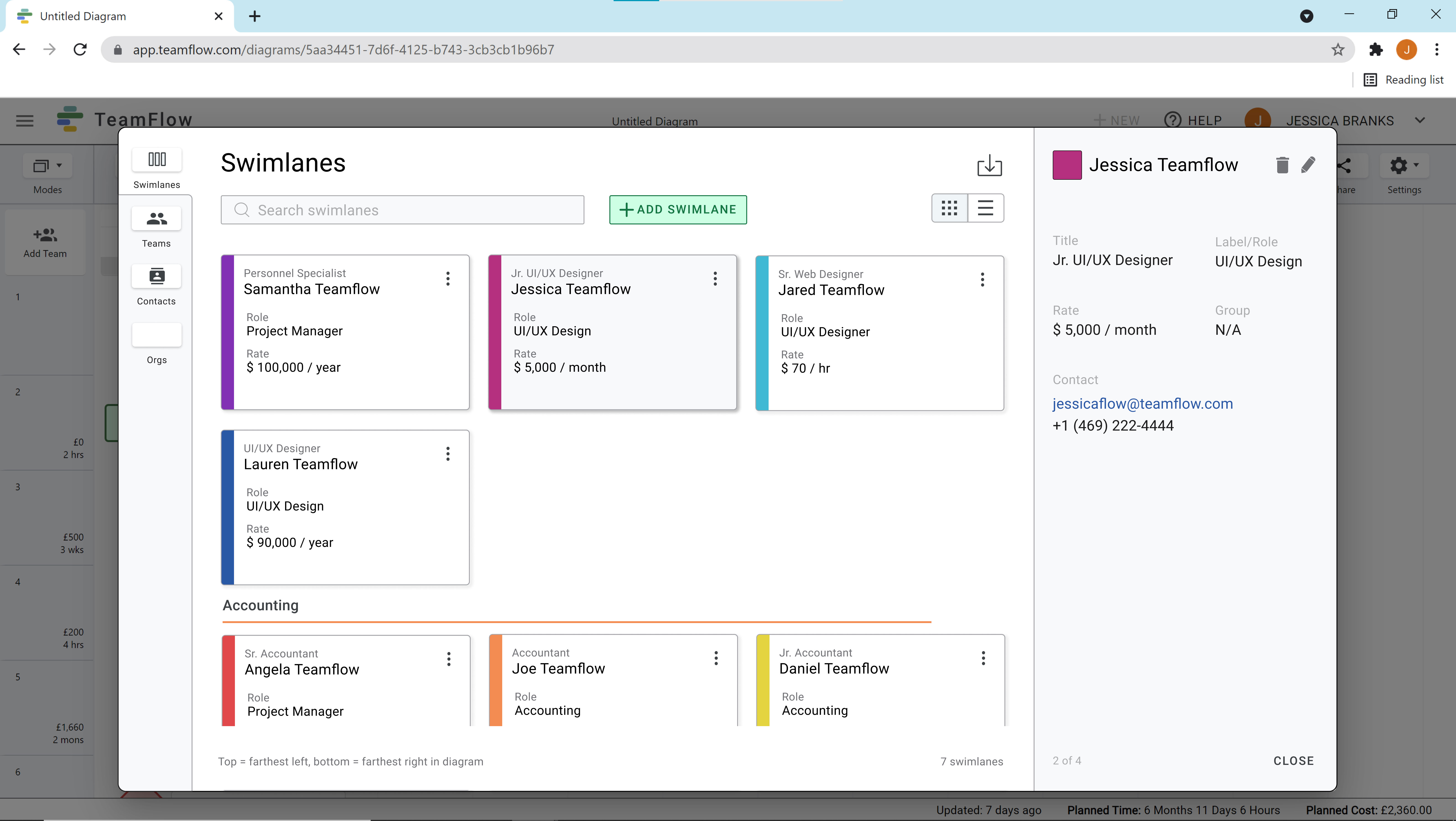
card view version of the same swimlane tab in the modal

Design Solutions

One of the main challenges for the new modal design was how to display all the details for each swimlane while still providing a more macro view for easy organization. We decided on using a sidebar layout to display the details for each swimlane, and act as an area to edit and add new swimlanes. This also allows for easier integration of new details and features that may be added in later updates.

Users can also toggle between contacts, teams, and a future feature called "orgs" from the left-hand navigation. We also wanted users to be able to choose between a list and card view and be able to drag and drop individual cells to reorder the swimlanes.
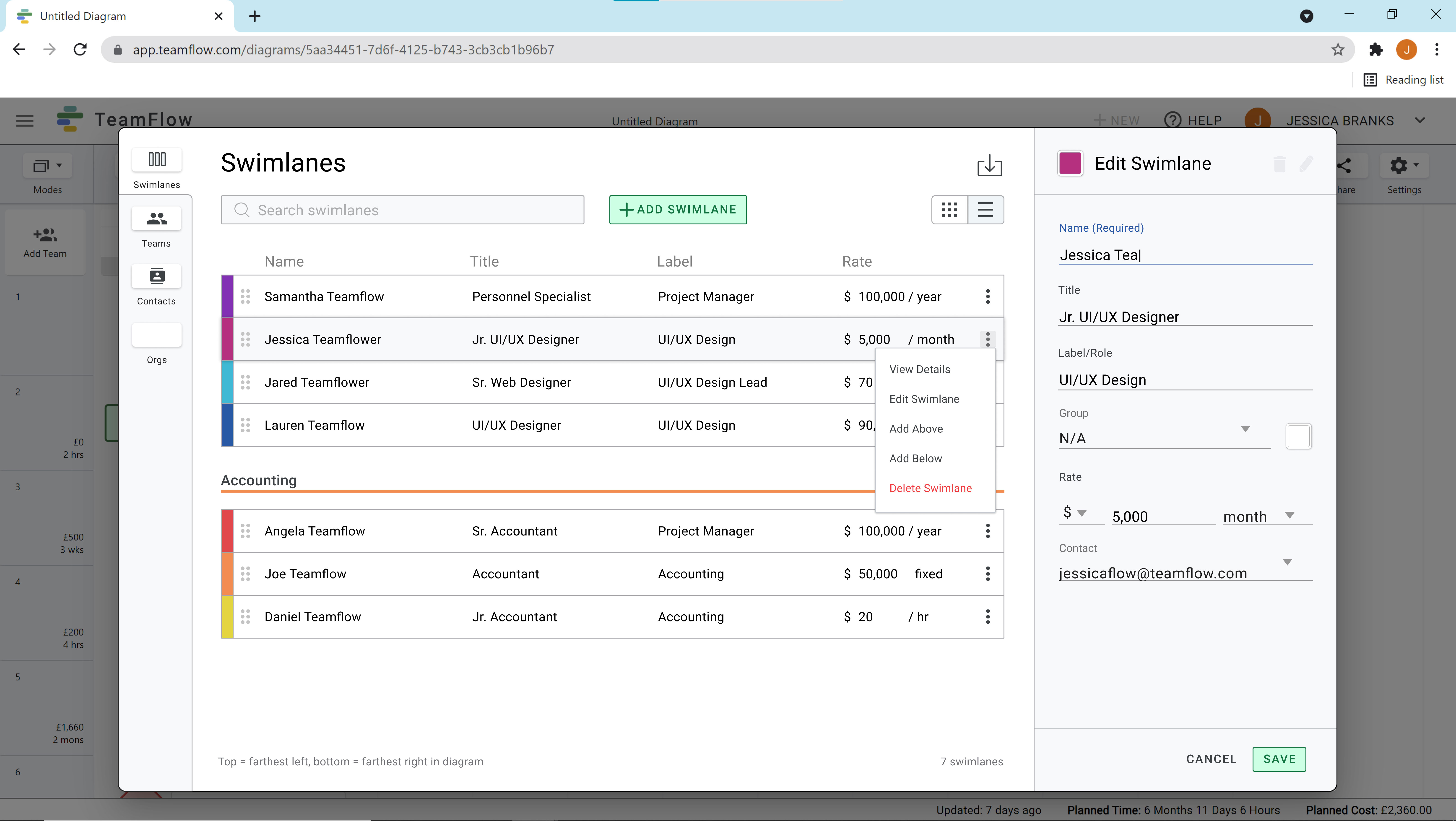
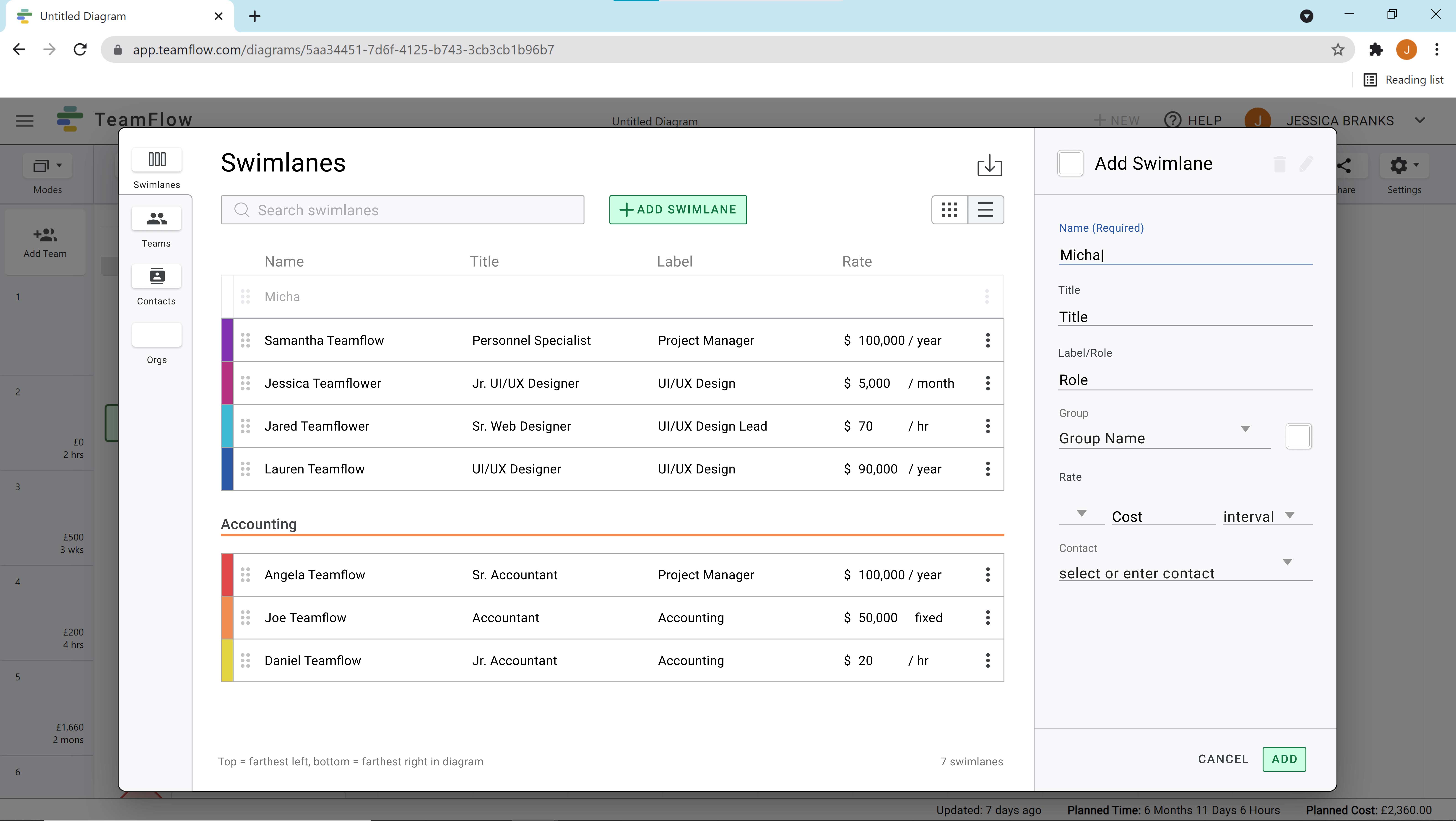
more button on individual swimlanes in the modal selected to show options to view details, edit, add above or below, and delete the swimlane with the right-hand sidebar showing the edit options
shows information to include add when the user selects add swimlane in the right sidebar with the option to add or cancel the task.

Editing & Adding

Users are able to edit and add swimlanes from the modal too. Either by hitting the "more" icon on the list or card, or the pencil in the details sidebar, users can easily edit a swimlane's information.

They also have the ability to add a new swimlane by clicking the button at the top or the "more" icon and selecting the "add above" or "add below." Users can then fill out all the information for the new swimlane in the sidebar.
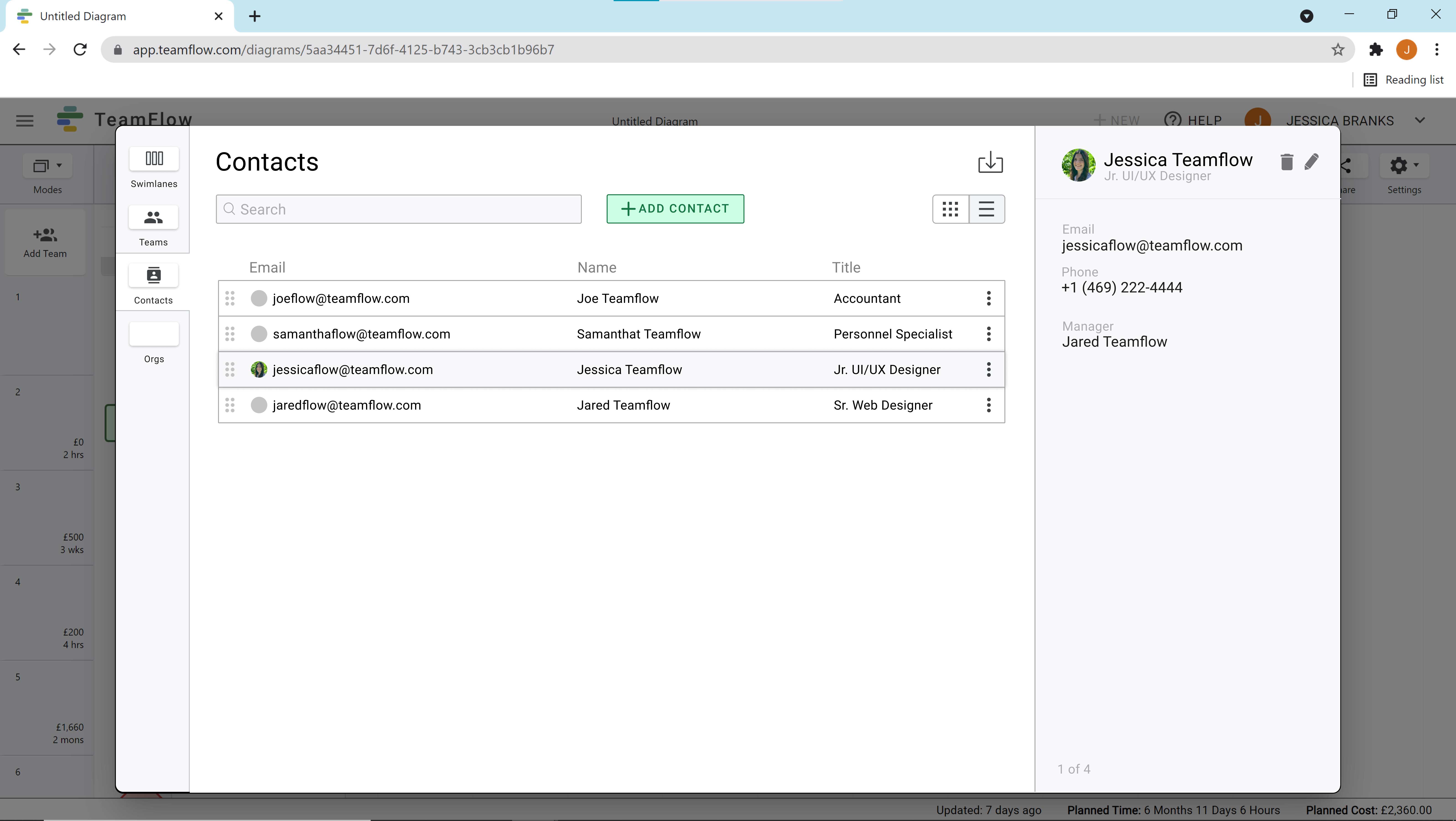
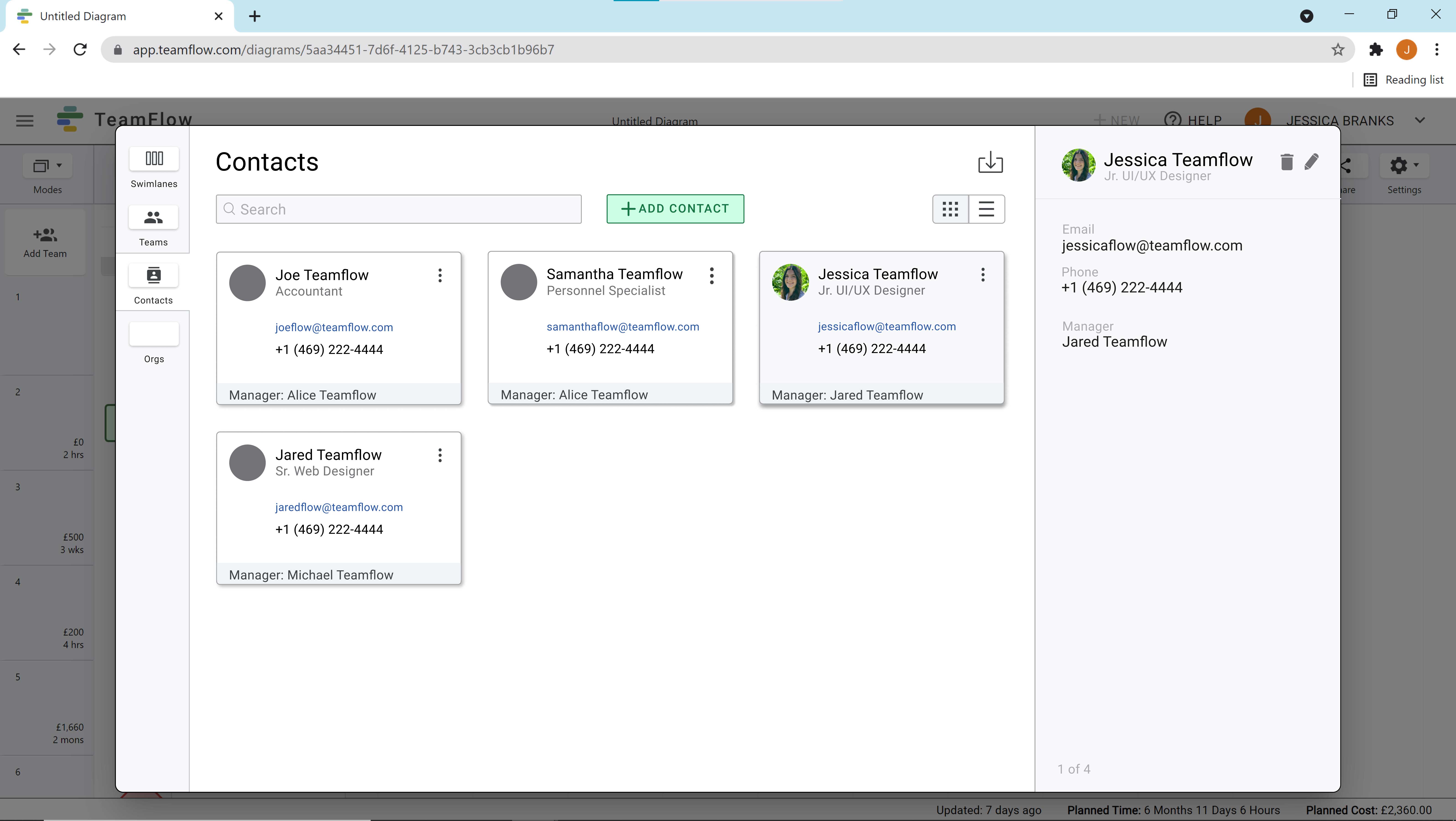
same modal before, but with the contact tab selected which displays contacts' pictures, emails, names, and titles in a list view, details of the selected contact are show in the right-hand sidebar
displaying same information as the previous image, but using a card view rather than a list view

Contacts & Teams

Just like swimlanes, users can organize, view, edit, and add contacts and teams from the modal. This is useful because users can import data for contacts and teams to use in swimlanes.
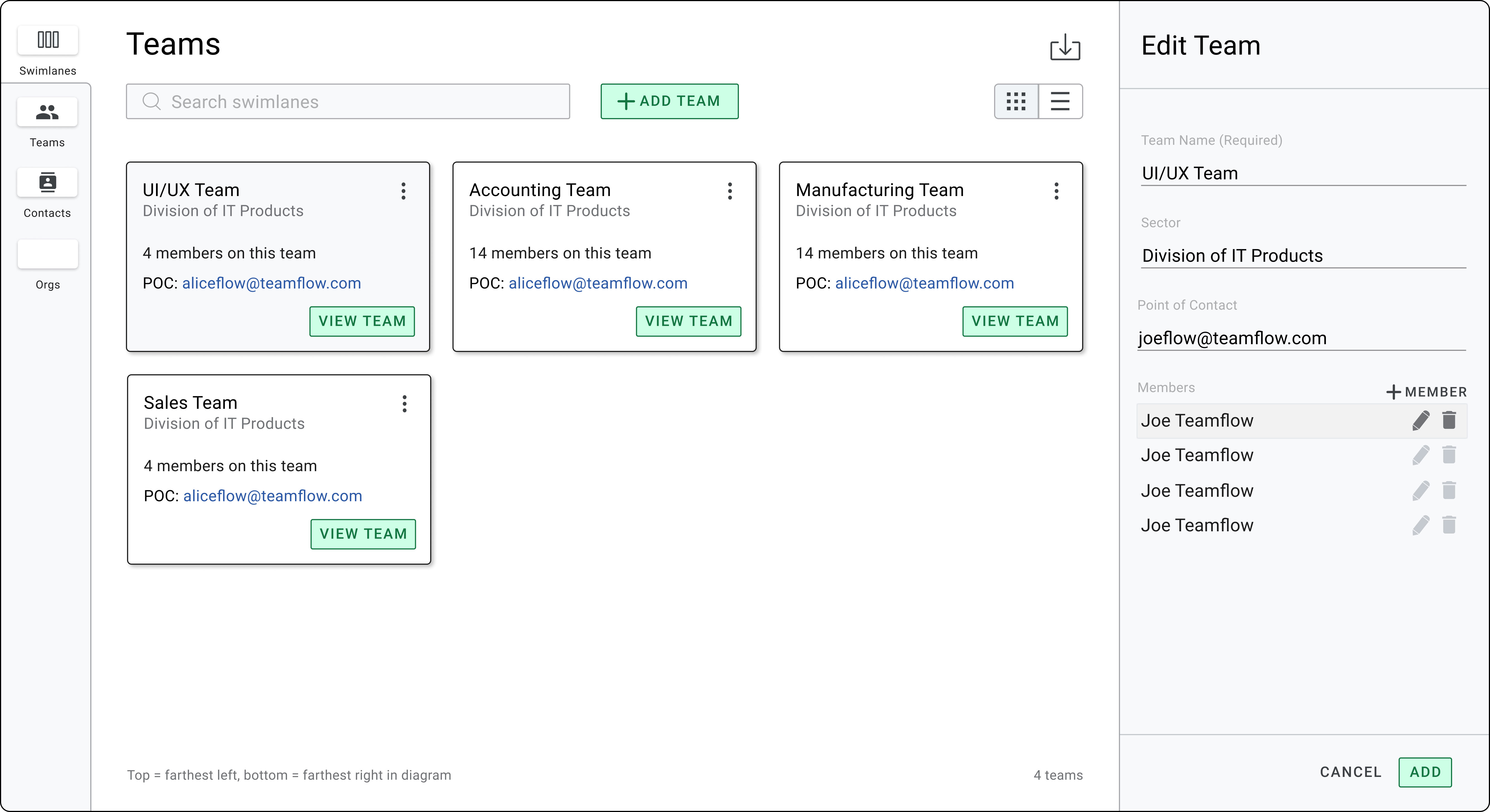
same modal as in the previous images, but with the teams tab selected which displays the team names, their divisions, number of members, and point of contact; in the right hand sidebar it displays the edit team options

What I Learned

This project has given me the opportunity to collaborate with other designers and apply what I've learned throughout personal projects and case studies to an existing project. Working with a team on a design systems library and prototypes taught me how to adapt my style to work with existing design standards and the needs of a business.

Having the chance to work with a senior designer also helped me develop my UI/UX knowledge through consistent feedback and critiques. Overall, this experience working for TeamFlow has really helped me grow as a designer and as a team player.

CASE STUDY

Harmony

E-commerce Website Design
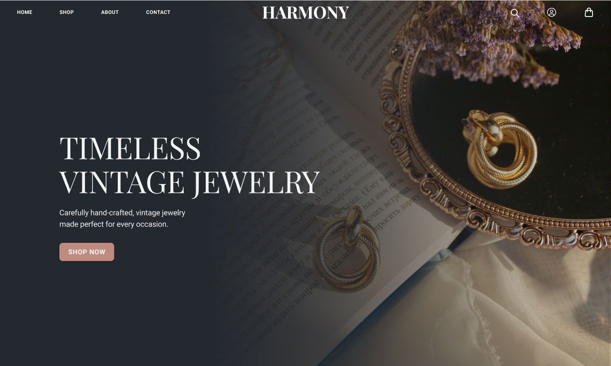
Harmony home page which contains a header, intro statement, and primary button to shop now on top of a fullscreen image of earrings
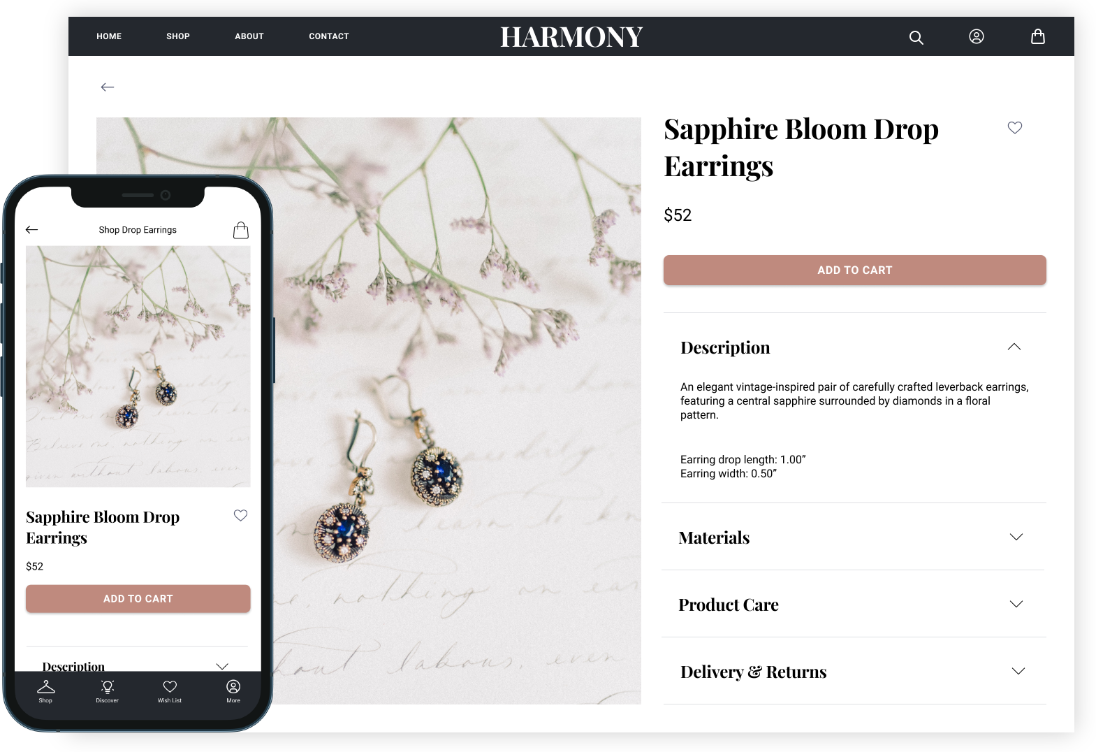
product page of the Harmony website shown in desktop and mobile versions

About the project

Harmony is an e-commerce website for a small business that specializes in crafting vintage jewelry. My goal was to create a cohesive brand identity and a clear, pleasant shopping experience for the users.

Design Challenges

As an e-commerce website, it was important to me to create a design system that was unique and evocative of the company's vintage style, and that would encourage potential customers to buy their products.

The website would need to showcase the products frequently without becoming overwhelming, as well as have an intuitive shopping process so customers would have a positive and memorable experience. Therefore, the design needed to be clean and simple without sacrificing the distinct character of the brand.
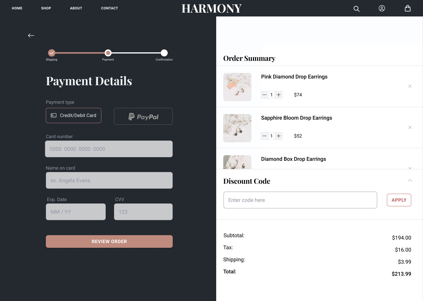
checkout page of Harmony website showing a split screen with checkout steps on the left and the order summary to the right
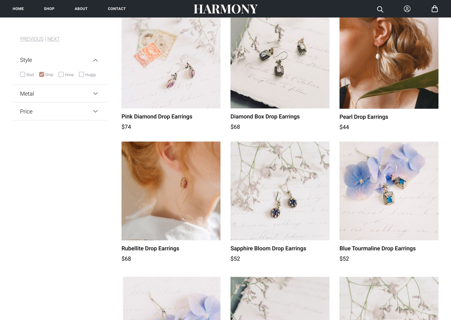
Harmony shop page with filters and page navigation in a left-hand panel and to the right a grid of images of the jewelry with their name and price below each image
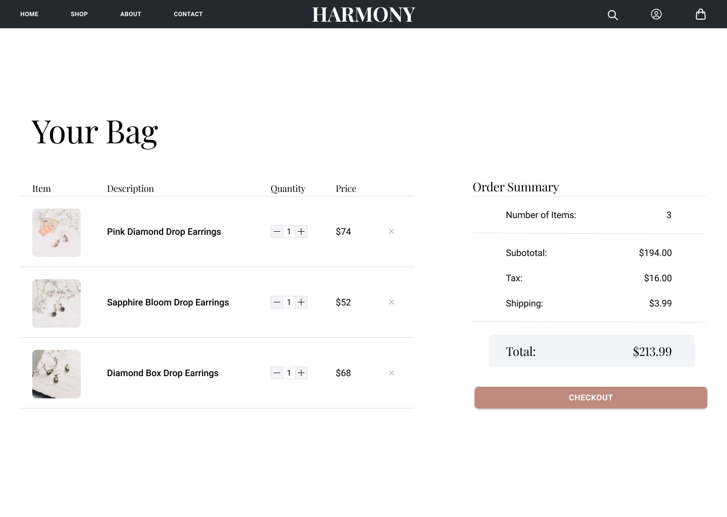
Harmony your bag screen taht shows list of items user added to their bag, quantities and prices of each item, and an order summary with the checkout button

Design Solutions

I decided to use a muted color palette and the serif font, Playfair Display, for headings to align with the brand's identity. Roboto was the secondary font used for paragraphs and other UI elements as it compliments Playfair Display and is easy to read.

Careful consideration of negative space and a clean, simple layout created an easy, streamlined shopping experience that is easy and delightful for customers to follow.
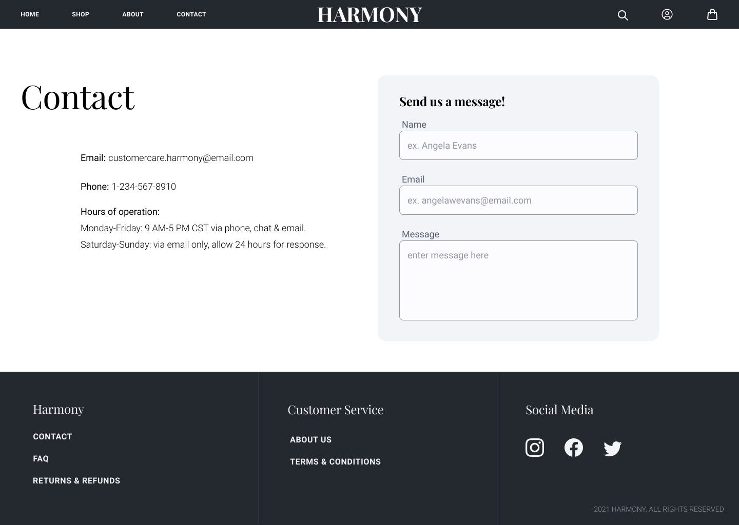
Harmony website contact page with the company's contact information and form to send them a message

What I Learned

Throughout this project I learned about component building and how to create a cohesive design system in Figma. I discovered how every design choice can impact brand identity and the user experience, and how to consolidate some of the obstacles between these requirements.

The project also acted as a springboard for me to learn basic html, css, sass, and bootstrap by recreating the product page in VS Code. You can find the code on my Github
CASE STUDY

Back Draft

Architecture Website Design

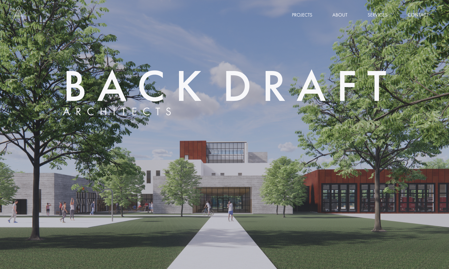
Back Draft website home page with a header and company name on top of a 3D rendering of a fire station
Back Draft website page for Station 20 showcasing renders, architectural drawings and details about the project with an option at the end to contact the firm or view the next project

About the project

I have always had a passion for the arts and functional design, and I was intrigued about how design decisions affect people and the world around us. This encouraged me to pursue a degree in environmental design at Texas A&M University.

During my studies there, I became more fascinated with technology and how it has changed the way we design buildings, and ultimately how it permeates all aspects of our lives today.

This led me to pursue a career in UI/UX design after graduation, and I thought a fun way to showcase both my previous projects in architecture and my newfound knowledge of UI/UX design would be to create a mock architecture firm's website.

I came up with Back Draft, which is a mock architecture firm that specializes in commercial buildings and wants a clean, modern website that showcases their previous work in order to attract future clients.

Design Challenges

The biggest challenge of this project was working out how to organize the large amount of content associated with the different architectural projects. I had to decide what information was the most important in order to design a layout that accurately showcased the projects without becoming too cluttered or overwhelming.

Everything from the typography to the navigation system needed to be simple and clear in order to emphasize the beauty and complexity of the projects as well as provide an intuitive experience for contacting and learning more about the firm.

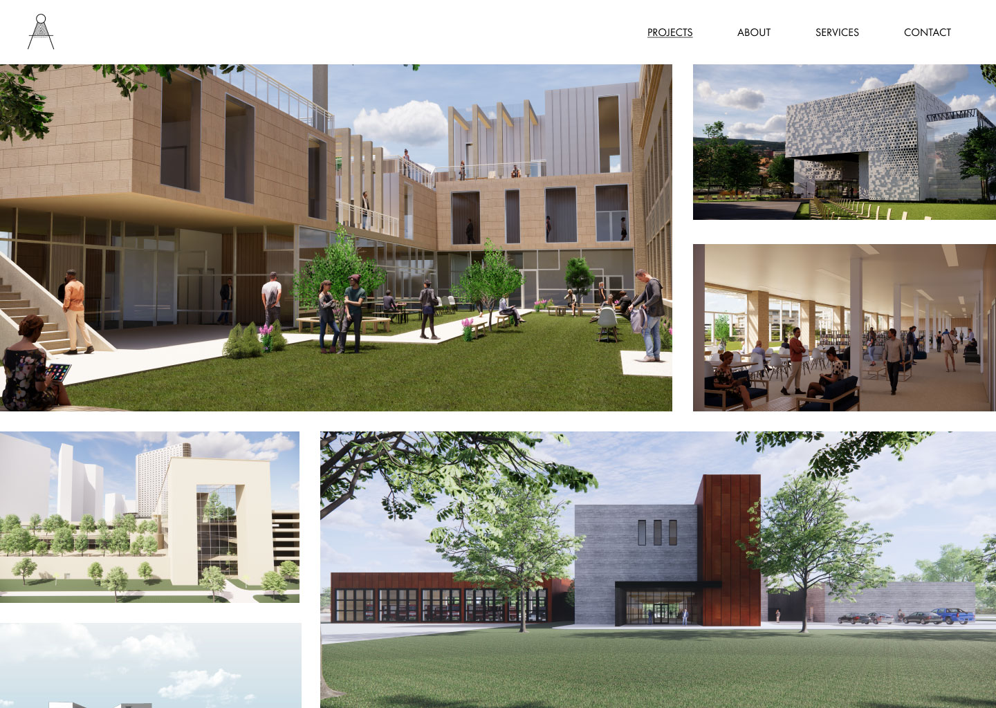
Back Draft website project page showcasing images of different buildings in an irregular grid
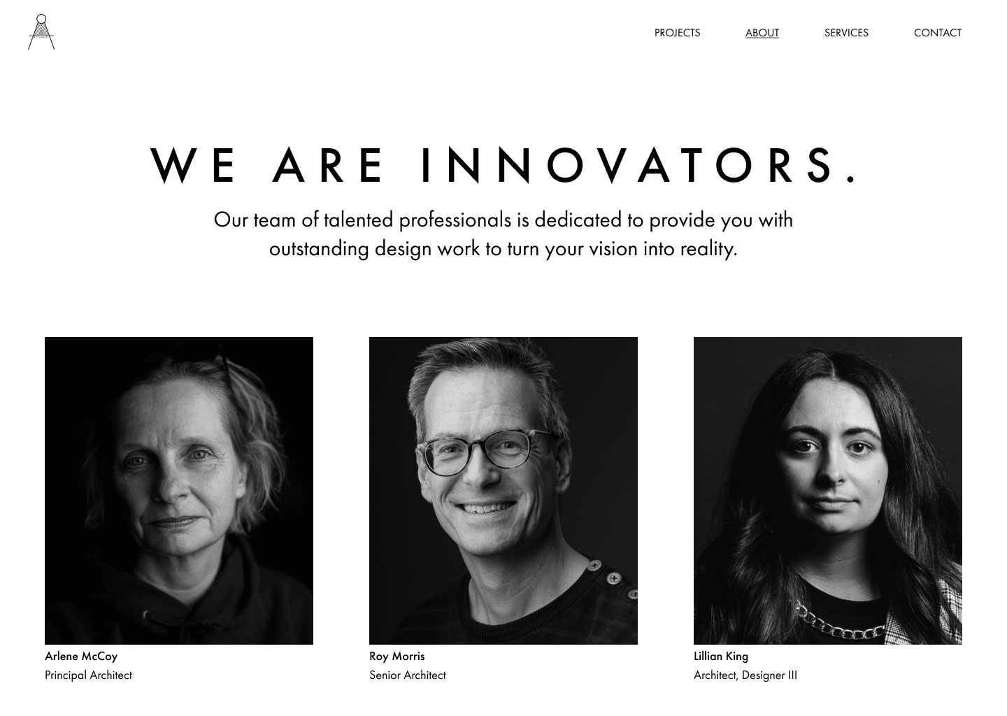
Back Draft about page introducing the team with their pictures, names, and roles
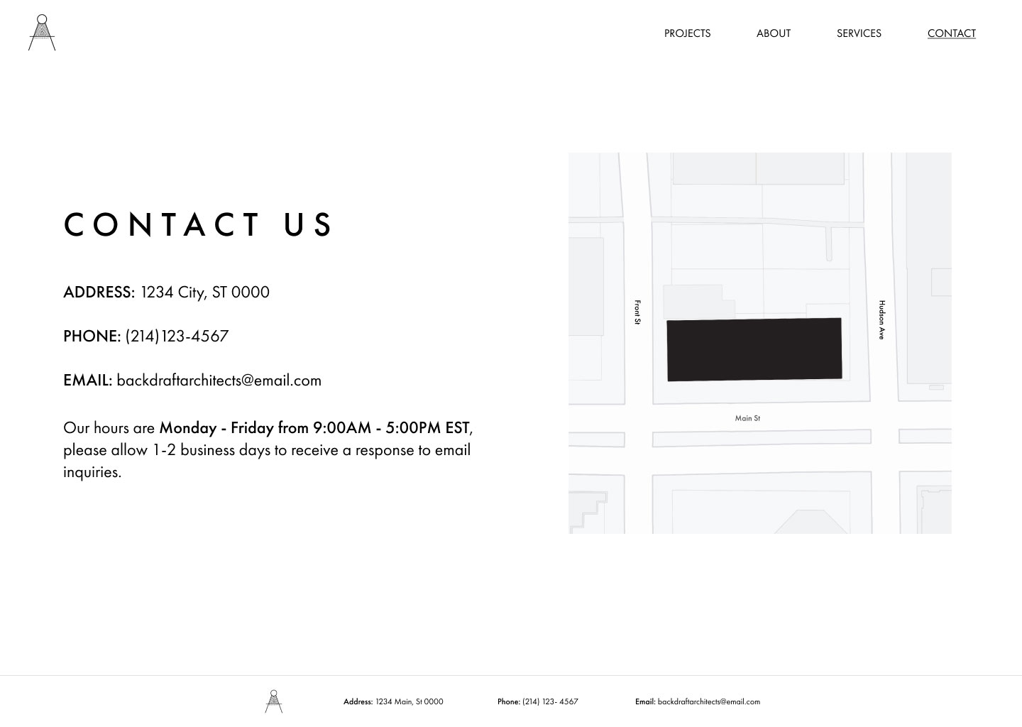
Back Draft website contact page with company's contact information, hours, and image of a basic map with their office highlighted

Design Solutions

I decided to use Futura for all of my typography because it is a sans serif font that is very easy to read and has a modern edge. It maintains the clean, modern look the firm wanted and doesn't distract from the images.

The black and white scheme used for the "about" and "contact" pages juxtaposes the colorful project pages to provide emphasis to the projects and makes the process of contacting and learning about the firm simple and clear.

Back Draft website page of an Anthropology Complex including renderings, architectural drawings and diagrams, and information with an option to contact the firm or view the next project at the bottom of the page.

What I Learned

I learned that architecture provided me with many skills and tools that are applicable to UI/UX design. My time studying architecture, interning, and working on projects taught me about functional design, how to design for users while considering practical restrictions and clients, 3D modeling and rendering, how to create 2D graphics that are beautiful and informational, how to work with teams with different needs and visions, and how to consolidate artistic vision with practical application.

The mock website design helped me to better understand information architecture and how to organize large amounts of content a client may want to include on their site. This project was also an opportunity to work more with Figma and learn how to use its prototyping capabilities. Overall, this website design showed me how I can apply all that I learned in architecture, from practical tools and project restraints, to empathy, creative vision, and UI/UX design.