The problem
People pursuing surrogacy face a lot of information that is often outdated or contradicts itself, and most of it arrives while they’re stressed, vulnerable and worried about cost. The Surrogacy Foundation wanted a chatbot that could match intended parents with grants, education and support programs that fit their situation.
As the UI/UX designer, I designed both the conversation and the interface.
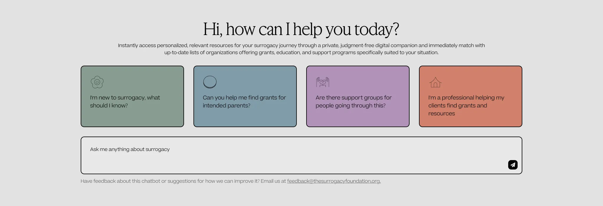
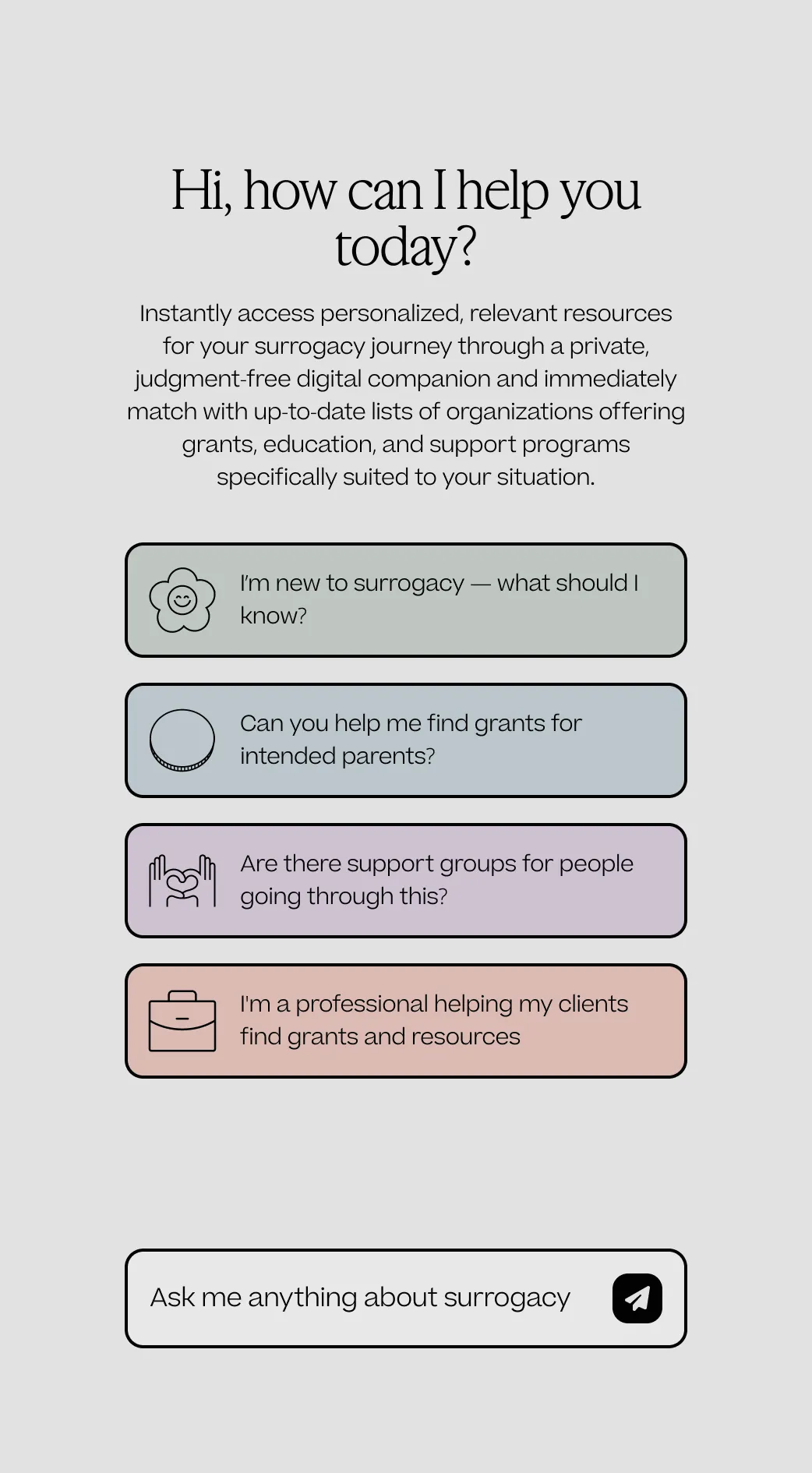
- 01Four starting pointsNew to surrogacy, grants, support groups, and a path for professionals. The open text box below is there for anything else.
Planning with the client
I started by writing down what we needed to agree on. That included the chatbot’s main goal, the topics it should stay away from, what it was allowed to ask, how it should sound, and what should happen when someone asks a legal or medical question. I went through these with the client in our meetings.
The legal requirements set the most important limit. The chatbot could not collect identifying information. I wrote that down as a boundary alongside the tone guidelines, and it shaped every flow afterward.
Prototyping with a language model
I built the first version in PromptOwl as an AI chatbot that answered in natural language. I tested it by going through many different conversations, like a parent just starting out, someone looking only for grants, and someone asking things it couldn’t answer. Each round showed me where answers got too long, where it needed more context, and when it should hand people off to a real person.
Designing the conversation
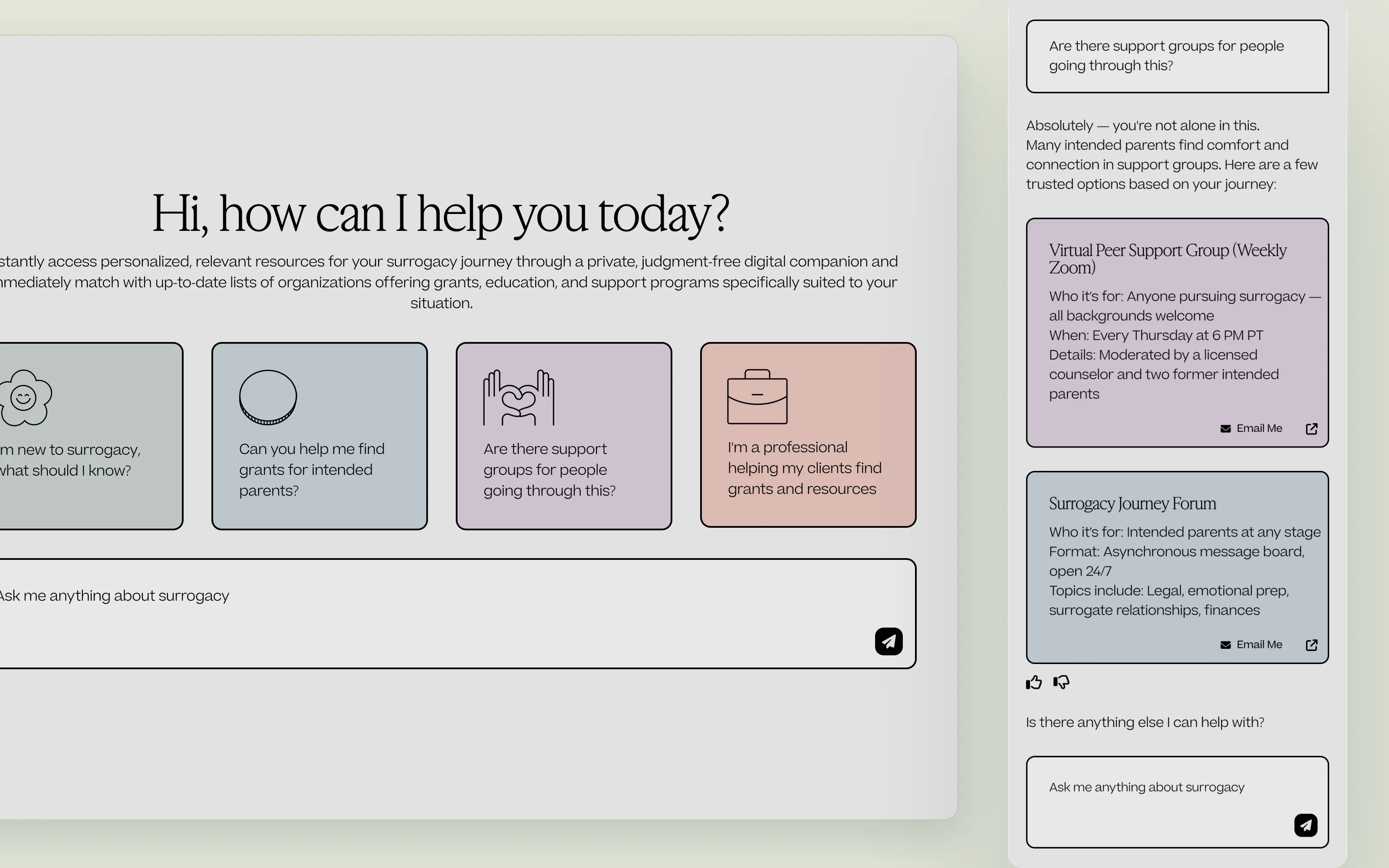
- Start with suggestions, not a blank box. People who are new to surrogacy often don’t know what to ask, so the chat opens with four starting points. The open text box is still there for everything else.
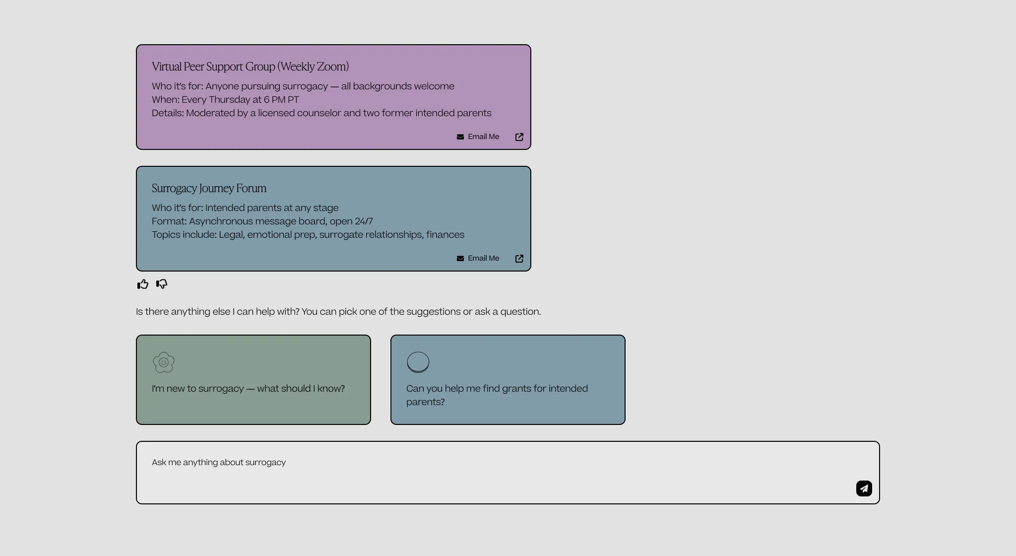
- Show answers in small pieces. Resources appear as short cards with who they’re for and a link, so nobody has to read a wall of text.
- Collect only what matching needs. The professional path first asked for client names and details. Once we covered the legal requirements, I changed it to accept up to five de-identified summaries with income ranges instead of exact numbers.
- Recommend only real, verified resources. Results come from the foundation’s approved list. When nothing matches, the chatbot says so plainly and offers related options instead of guessing.
- Keep a person close by. “Talk to someone” is always an option, and the chat explains how to reach the team after hours.
- Make feedback easy without getting in the way. A feedback email link sits under results and under the no-match message. I kept it out of the menu and out of the conversation, so feedback never interrupts someone looking for help.
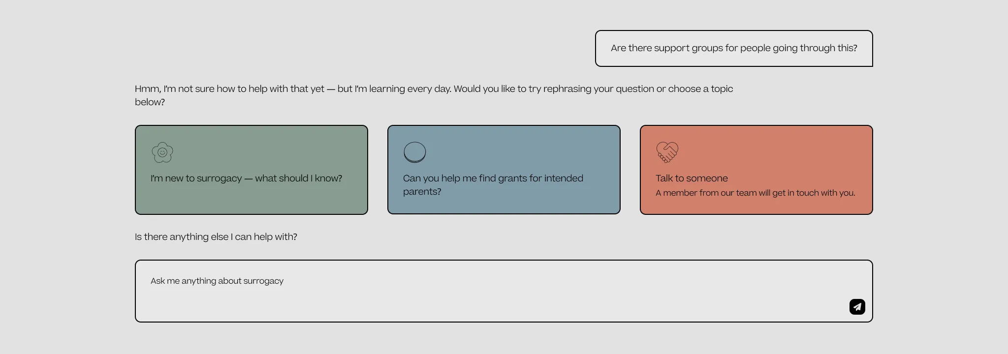
- 01A person, not a dead endTalk to someone sends the request to a member of the foundation’s team.
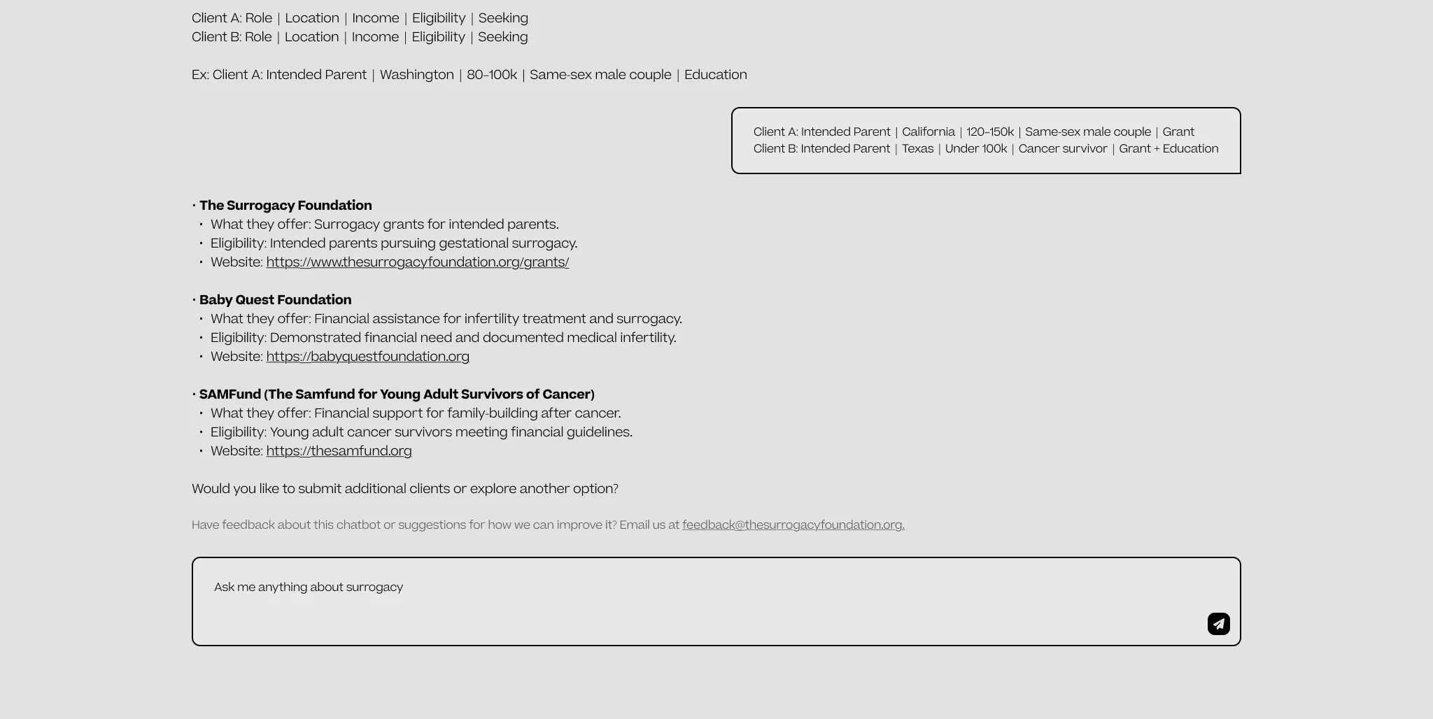
- 01De-identified by designRole, state, an income range and what they’re seeking. No names, ages or exact incomes.
- 02Feedback as a utilityA quiet email link under results, never a step in the conversation.
Designing the interface
I designed the chatbot’s interface within The Surrogacy Foundation’s brand at the time, for both desktop and mobile. The goal was for it to feel calm and personal, not like a support ticket.
- Color-coded starting points. Each of the four suggestion cards has its own color and illustrated icon, so people can see the options at a glance. The same cards stack into a single column on mobile.
- Large, rounded tap targets that are easy to use on a phone.
- Answers people can scan. Resource cards show who a program is for, how it works and where to go next, with buttons to email or save it.
- Signs that it’s working. I designed a loading state and a typing animation so people know a response is coming.
- Ways into the chat. I explored icons for a floating chat button, and designed a “Surrogacy Support” page that explains what the chatbot does, how privacy works, and how to reach a person.
- Reusable components. I built the prompt buttons, send button and resource cards as components with color and hover states, and handed them to the developer.
Shipping a scripted version first
The version that launched had to be scripted rather than built on a language model. I worked with a developer to build it. I handed off the requirements, the conversation paths and specs like the feedback placement, and then tested the build. It was published on the foundation’s website, and the client asked people they knew to try it.
Where it landed
The plan was to move the launched chatbot toward the natural language version I had prototyped in PromptOwl. We didn’t get to that stage, but the scripted version was built on the same conversation design, so the paths, boundaries and tone would carry over.
The foundation has since rebranded and redesigned its website, and the chatbot is no longer on it. The screens here are my designs from the time, with the logo and site navigation removed.