The context
TeamFlow is a web app that helps organizations build clear, consistent process flow diagrams. During my internship, I worked with a senior UX designer on two projects. I helped update the company’s design system, and I designed and prototyped a new version of the swimlanes modal.
Updating the design system
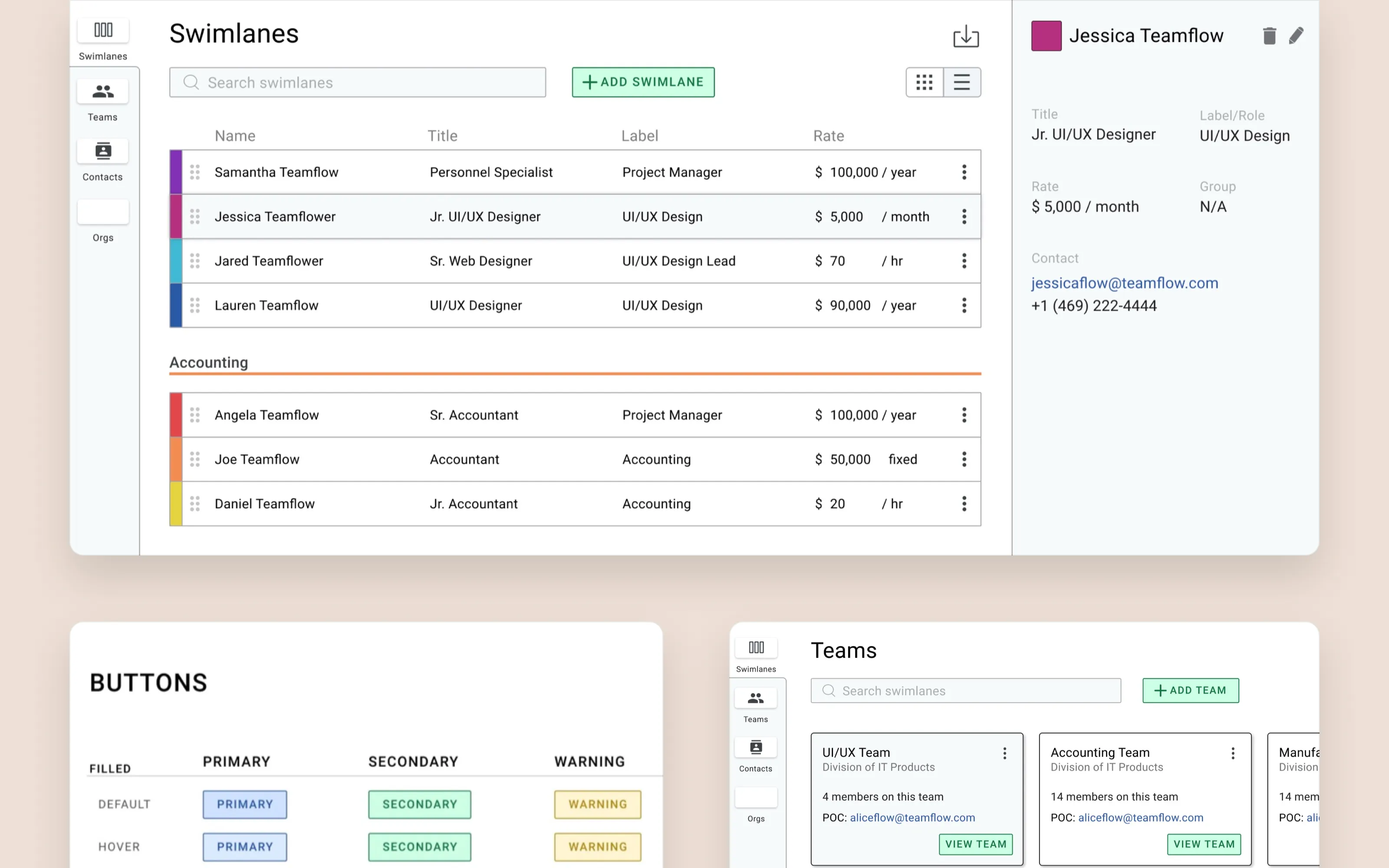
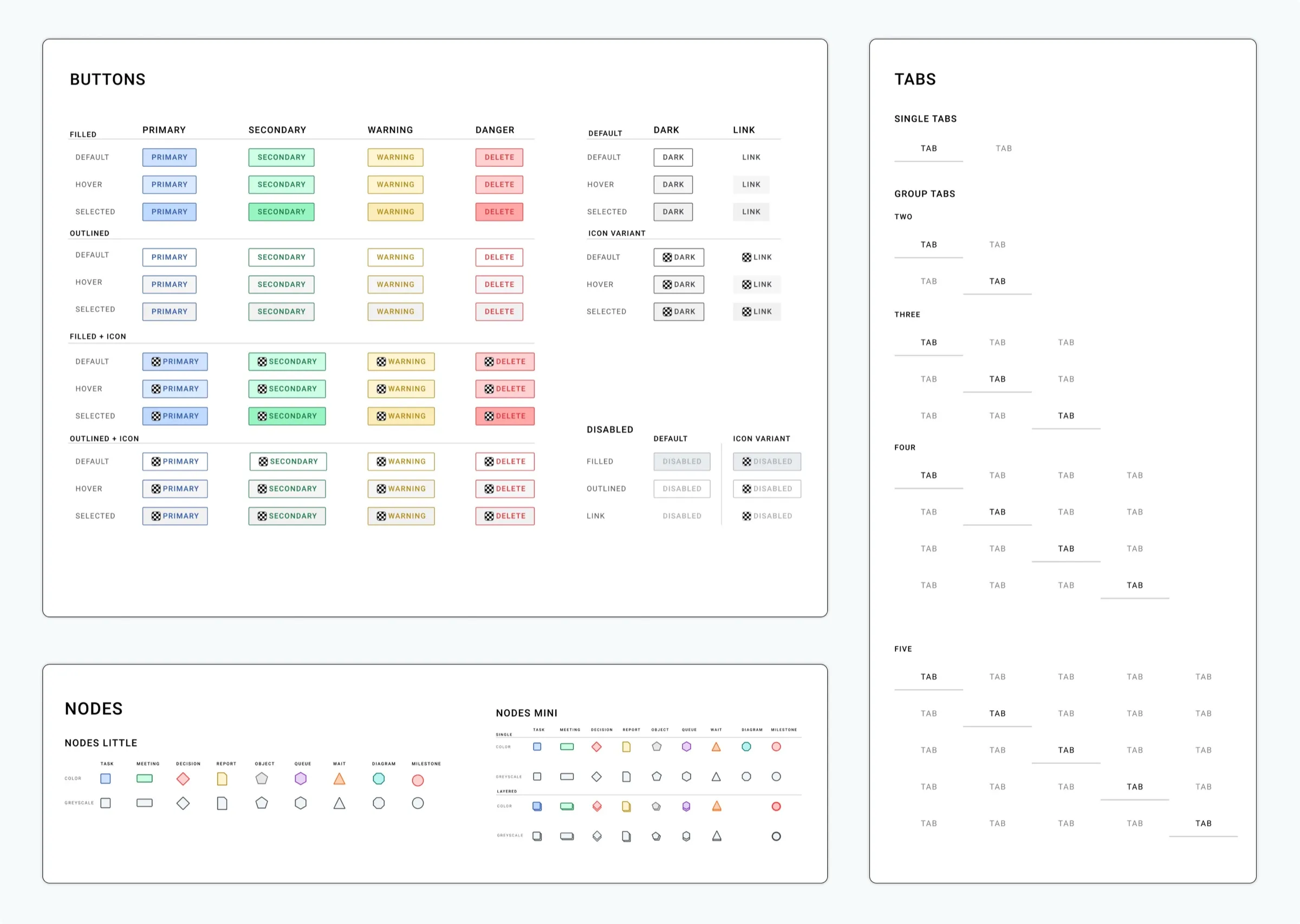
The senior designer and I reviewed which button states and variants needed updating. I implemented the changes and built new button components for every type, from primary to danger. Each one comes in filled, outlined and icon versions, with default, hover, selected and disabled states.
I also connected the buttons to the library’s existing styles and created a naming system for the variants in Figma. That made it faster for the team to find the right component when prototyping.
Redesigning the swimlanes modal
In a TeamFlow diagram, each swimlane is a person or role in the process. The modal for managing them needed to hold more detail, like title, role, rate and contact information, and to make organizing, editing and adding swimlanes faster. We also wanted contacts and teams in the same modal, since their information links to swimlanes.
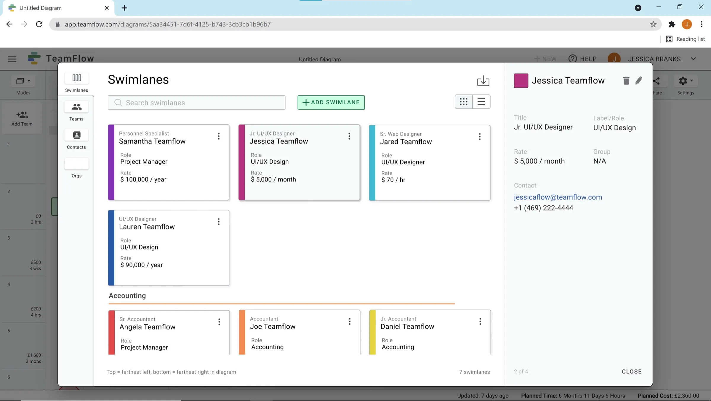
The main challenge was showing every detail for each swimlane while keeping a big-picture view for organizing them. We chose a sidebar layout. The list stays visible on the left, and the sidebar shows the details for whichever swimlane is selected. The sidebar is also where you edit or add a swimlane, and it leaves room for details added in later updates.
People can switch between a list and a card view, and drag rows to reorder them. The order in the list matches the order of swimlanes in the diagram, top to bottom becoming left to right.
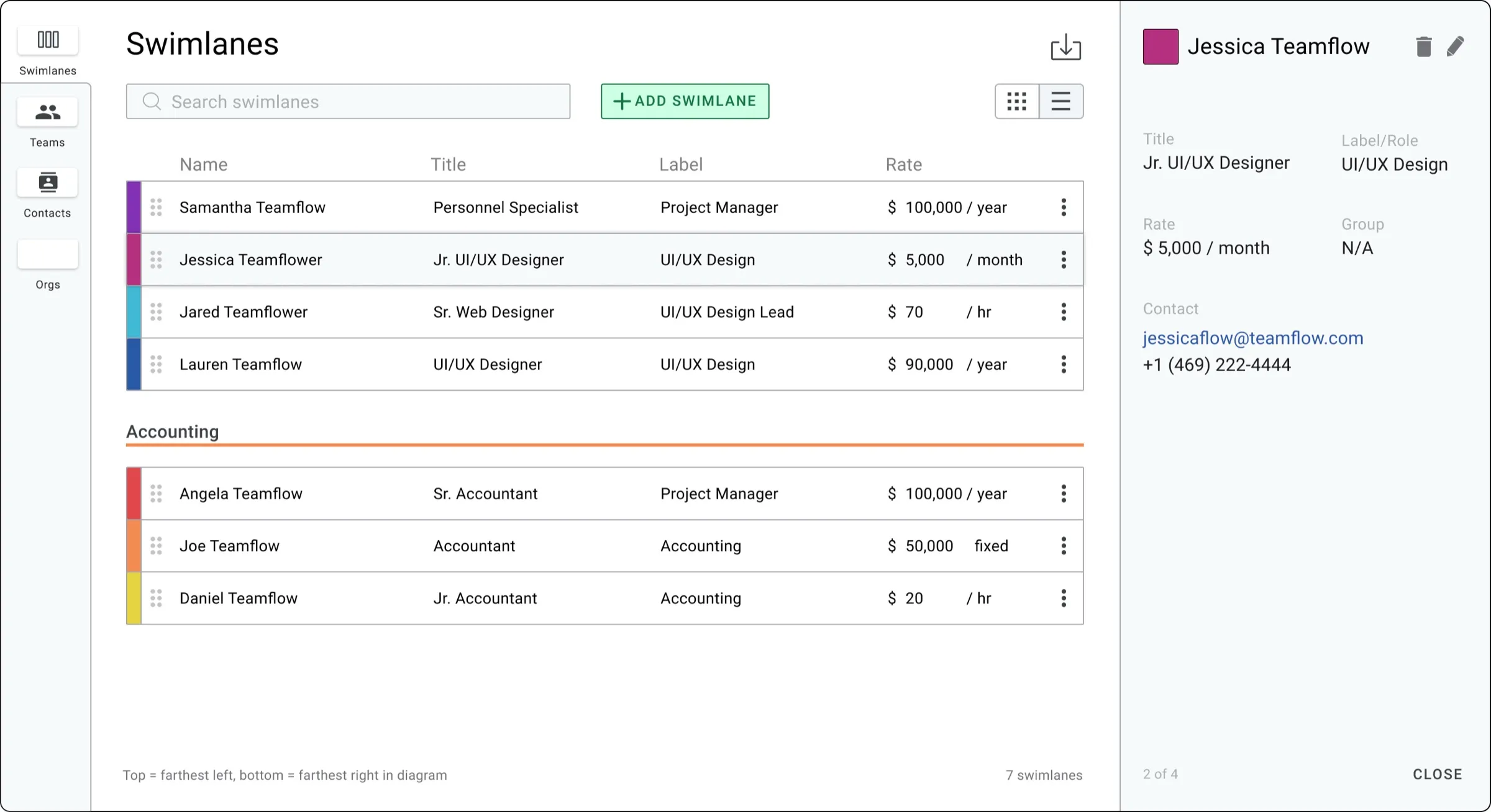
- 01One modal for everythingSwimlanes, teams, contacts and orgs share one modal, switched from the left.
- 02Details sidebarShows the selected swimlane, and is where you edit it.
Editing and adding
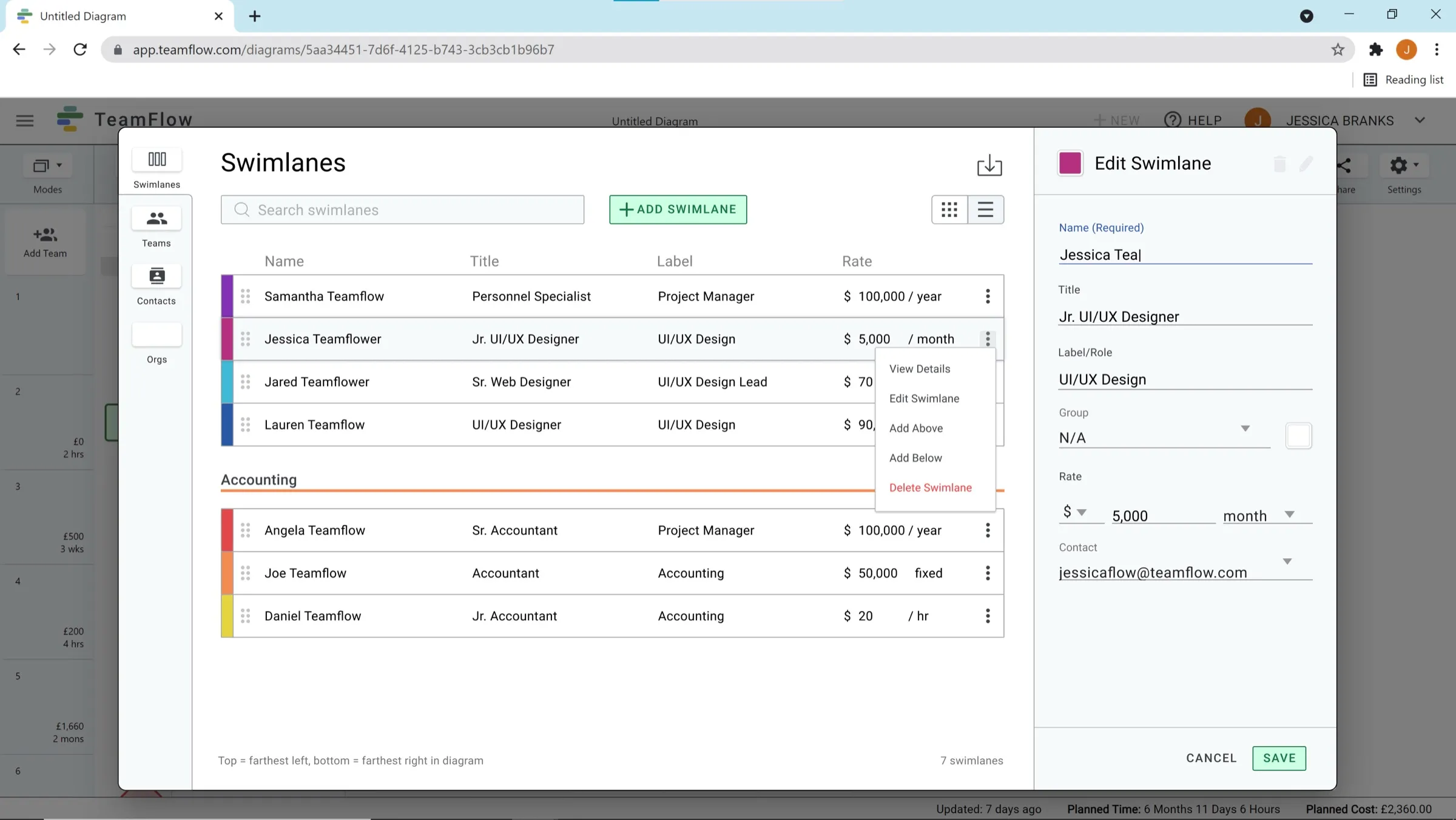
You can edit a swimlane from the “more” menu on its row or card, or with the pencil in the sidebar. To add one, you can use the button at the top, or choose “Add above” or “Add below” from the menu so the new swimlane lands exactly where it belongs. Either way, you fill in the details in the sidebar.
Contacts and teams
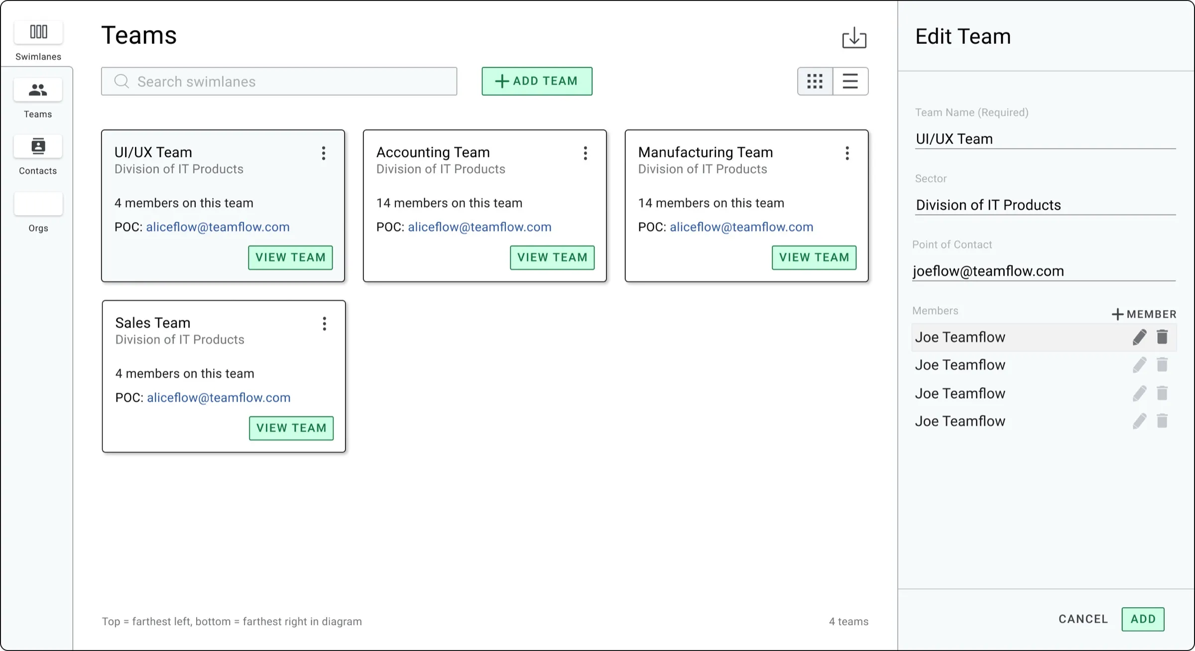
Contacts and teams work the same way as swimlanes. People can view, organize, edit and add them from the modal, and import their data to use in swimlanes.
What I learned
This internship was my first chance to apply what I’d taught myself to a real product, working with a team. Working on a shared design system taught me to adapt my style to established standards and to the needs of a business. Regular feedback and critiques from a senior designer helped me grow quickly, both as a designer and as a teammate.